Every few months, I become wildly dissatisfied with my relationship with my mobile phone and vow to take steps to change it. Typically, that has meant removing reasons to pick it up – I want to be able to come home, throw my phone in a drawer and then not think about it until I leave home again.
In the past, this has resulted in:
- Suggestions to my friends that we should all get landlines because it’d be “fun”
- The same but with fax machines, because it’s kinda lo-fi SMS1
- Prototyping a thing which plays Spotify playlists based on floppy disks to deal with the fact that I miss CDs (maybe I should just buy a CD player).
I think part of the problem with phones is that they’re devices for everything, and so moving back to single-task devices feels closer to what my lizard brain can handle.
To that effect: I thought it would be cool to have the weather forecast accessible somewhere in the morning as I’m choosing clothes, without having to pick up my phone.
Pimoroni make a 7" e-ink display with a tiny Wi-Fi-enabled computer attached, so I bought one last week, and set about trying to get the weather forecast on it.
Here it is:
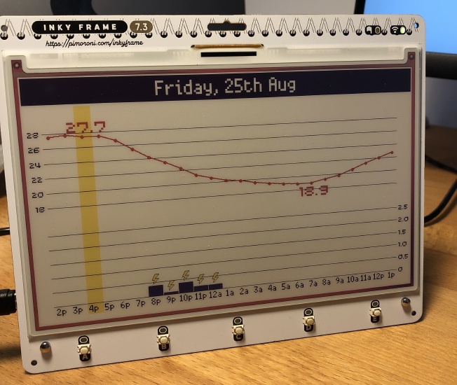
There were storms when I was writing this.
This post talks about the design choices; I’ll do one about wrangling weather data Soon™️ (it was a journey).
Tell me more about this e-ink screen thing
This is a 7" colour e-ink display with a tiny Wi-Fi-enabled computer attached. Everything comes preassembled.
The use of a colour e-ink display for the screen is the fundamental design choice here. It’s basically like the screen in a Kindle, just lower-resolution, and with seven colours. This means:
The image stays when the power cuts off. Alternatively: you can keep the screen on without using any electricity.
Refresh time is long. On a typical black-and-white e-ink display, a full refresh takes maybe a couple seconds – typically it flashes everything black, and then white, before rendering the image – but this is a fancy 7-colour e-ink display, and so it takes approx 40 seconds – it flashes through every colour in turn before rendering the image, and then renders every colour individually. The screen is unreadable during these updates.
You’re limited to a very small number of colours. In this case, Black / White / Green / Blue / Red / Yellow / Orange. You cannot mix them; each dot is a single colour. If you want to use colours in between, the best you can do is to use a technique called dithering, which kinda works if you squint, but this display has pretty large pixels, so you need to squint a lot.
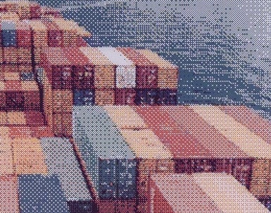
A closeup of the sample image that comes ‘preinstalled’
(source: Pimoroni, cropped)
This means:
- We should prioritise updating infrequently.
- We can probably power it for a really long time using batteries.
- We should stick to designs with sharp edges, no motion, and single colours.
WarnWetter as inspiration
Here’s my screen again:
The two graphs are temperature (the red line) and rainfall (the blue bars). I basically lifted this design from the WarnWetter App – the official Android / iOS app from the Deutscher Wetterdienst (aka DWD, the German Weather Service).
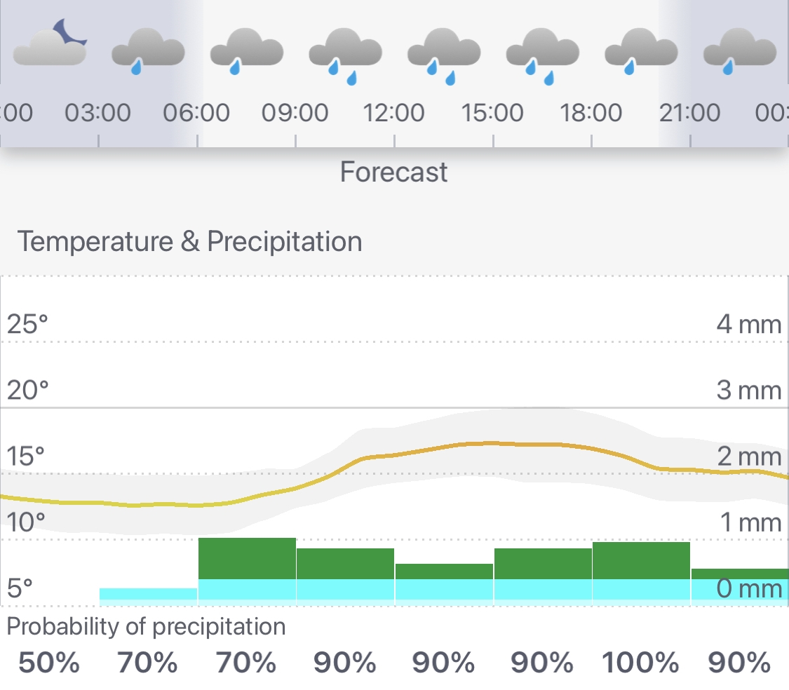
Tuesday’s forecast in WarnWetter
Jumbo Max / Min temperature numbers
I added the big numbers for the max and min temperatures because that’s what you actually care about when you’re looking at the forecast.
The questions you’re trying to answer are:
- “should I wear shorts / a dress / that top that’s kinda halfway between a t-shirt and a sweater” and
- “should I bring a jacket if I’m out for drinks after work”
…and for those you need the numbers, not the graph.
It probably wasn’t super necessary to put the graph in at all, actually. But having it helps answer the question “is it over yet” on a hot summer day, and helps you answer the “Jacket Question” with more precision in autumn and spring.
Yellow bar shows current time
The yellow bar goes from the time the screen last updated to the time that the next update is scheduled. That is: the current time is always somewhere in the yellow region.
This has two purposes:
I do that “goldfish memory thing” where I look at the forecast, and then not remember what the time is, and then look for a clock, and then check the forecast again once I know what the time is. And I usually get distracted on the way 👎. Now I don’t have to go looking for a clock.
This feature is how you check that the screen is still updating. The device will eventually be battery powered, so it’s important to have a way of knowing if the batteries have died, given that the screen stays on even without power.
Next 24hrs only
This is only a 24 hour forecast – the data source I’m using gives me a whole week of data, though, why not show more of that? I figured that most of the time when I’m looking at the 7-day forecast, it’s because I’m planning, and if I’m planning I’m probably texting people, and if I’m texting people then I’m on my phone anyway, and can just use the app.
Plus, I don’t have much space on this screen! Much better to stay focussed on the ‘what should I wear today’ question.
Tiny lightning bolts
The little lightning bolt icons are a compromise. I originally wanted to have full weather icons above the temperature graph like the WarnWetter app – I think they’re cute and useful! But putting icons on the screen turned out to be super painful.
First, you’ve got to find a source of icons and/or draw them yourself. I thought about extracting them from the WarnWetter App directly, but those icons are designed for full-colour, and so I’d have to simplify them dramatically for my pixelly, 7-color display2.
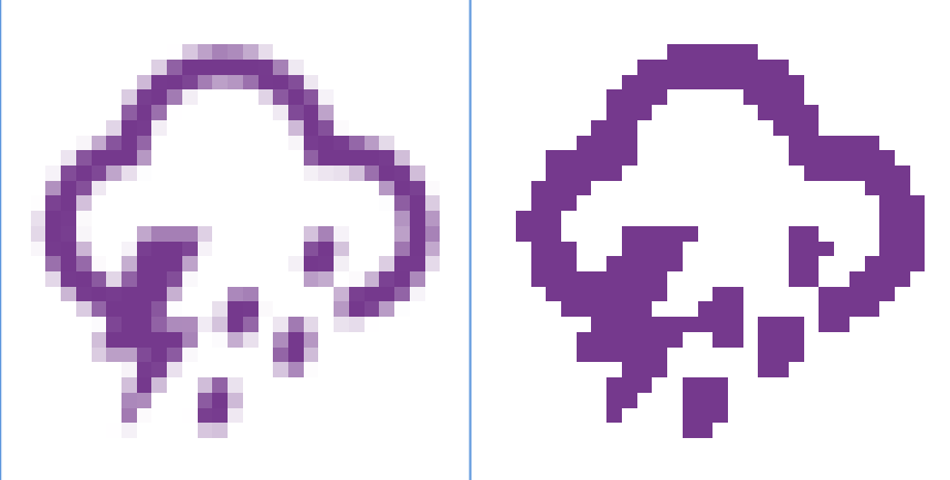
I then turned to the WeatherIcons project, which seemed promising, but all those lovely round edges pixellate badly, especially at small scales. I’ve only got 31 pixels per hour column to work with. If we were to do an icon every 3 hours (like what the app does!), we’ve got 93 pixels and it kinda looks ok:
This is supposed to be a storm with showers
But, I couldn’t figure out how the WarnWetter App was getting these three-hour icons; it’s not obvious from the data that WarnWetter’s servers are returning. The hourly icons were easy to figure out from the data, but that only leaves 31 pixels per icon, which is a lot of visual clutter. Plus, icons designed for the web are basically unusable at that resolution:
yuck
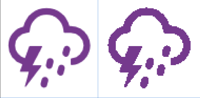
Ok, so time to make my own icons. I thought I’d solve the ‘visual clutter’ problem by only doing icons for lightning and snow and slapping them on top of the rain graph columns when they apply:
they’re kinda cute
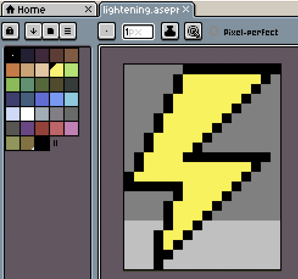
I opened Aseprite, a pixel-art editor, and whipped up this tiny lightning bolt, only using black and yellow (no intermediate colours!):
Then I tried to load it on to the device… and it turns out that there’s not really software support for loading icons like this. The device / software supports jpegs, but jpegs don’t support transparency, and are otherwise definitely overkill for what I need. The processor on this device is tiny and only has a small amount of RAM, and jpegs are designed for photos and full-colour displays. Consequently, I was worried that rendering that lightning bolt from jpeg would be a lot of work for the processor if you have to do it multiple times, and that might be bad for update speed and/or battery life (in addition to the transparency thing).
So, ok. I guess the only solution is to write code to draw this as a bunch of lines.

Fifteen incredibly frustrating minutes later, I got my cute lil’ lightning bolts. I’ll do the snow icons when we’re closer to winter.
Overshoot on the graph
This one is more fun than practical: the temperature line will overshoot / undershoot the graph bounds if it’s over by less than 0.5 of a degree (celsius); I did this by accident initially but I thought it looked cool and then productionised it.

Plus those horizontal lines get really noisy when they’re too dense together. If we can skip one by just overshooting a little it’s much nicer.
Similarly, if it starts flooding, the rain graph just gives up on scaling things neatly and draws a bar that eats into as much of the rest of the screen as it wants. From the code:
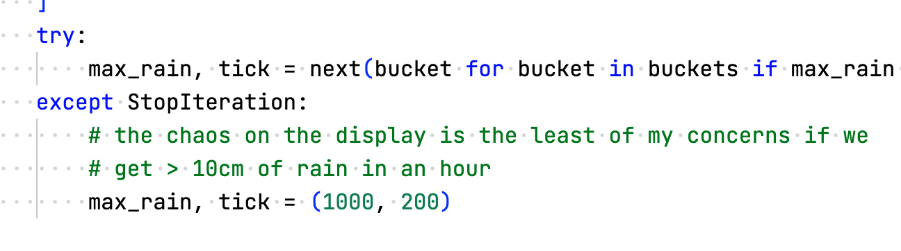
10cm of rain in an hour would be flash-flooding for sure
“no rain today” / “prompt engineering”
You might have noticed that there’s a lot of screen real estate dedicated to rainfall – but Brandenburg is one of the driest regions in Germany, and days without rain are pretty common. I decided that it’d be weird to just have a blank chart on those days, and to take the “this page intentionally left blank” approach instead. So when there’s no rain, I made it show the words
no rain today
but that’s a little boring for something that takes up so much space. Maybe I could make it say something vaguely entertaining? The first idea that popped into my head was
“no rain today, but maybe watch out for snakes?”
but it’s more fun if it cycles through options. So I turned to ChatGPT3:
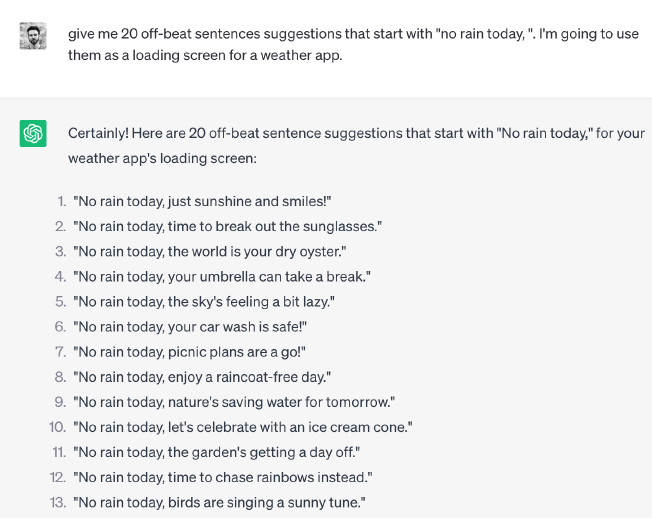
yeesh.
We have very different ideas of what “off-beat” means. Let’s try again.
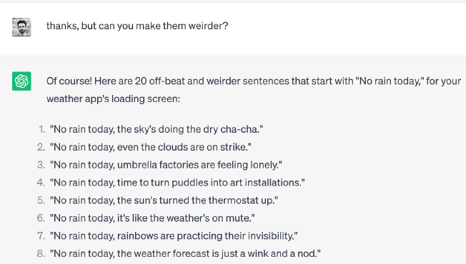
yeeeeeeeesh.
I dunno, man, this isn’t really what I had in mind, I’m getting a lot of “live laugh love” energy from all of these ideas and it’s making me deeply uncomfortable. I imagine someone reading one of these lines and then saying, “ha! I’m so quirky!” with far too much enthusiasm.
Maybe it’s too anchored on the whole ‘rain’ thing?
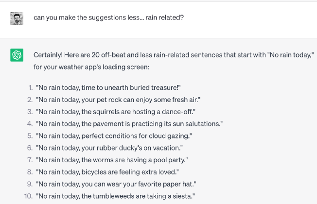
“the pavement… is practicing… its sun salutations??” 😐😐😐🫣
By this point I’m about ready to give up. One last Hail Mary:

YES OK now we are in business (maybe I need to ask for ’existential dread’ in all my ChatGPT interactions?).
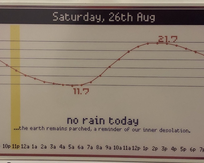
love a touch of existential dread with my weather forecast.
That’s it!
This is normally the part of the blog post where I do a “call to action”, and say something like “here’s the code, have fun”, but I’m not doing that today. This project is extremely hard-coded to both my Wi-Fi credentials, and the weather station closest to my house (Berlin-Alexanderplatz, 37m above sea level). Just figuring out how to identify the right ID for the weather station was super challenging, and I don’t want to write all the code to handle that properly, or field the questions about how to do it 😅.4
But: the idea that I’m pulling on here is that there’s something great about purpose-specific tech with simple interaction models, especially when you’ve made it yours like this.
It feels a little bit like noticing the way you move through the kitchen when you’re cooking, and then adding storage so that you’ve always got a wooden spoon or a small bowl within reach exactly when you’re about to need it. Or a little like realising that you almost always dump your keys in a spot near the door, and then adding key hooks next to the door to make it official. We do this all the time in the physical world, so I’m a little sad that we settled for disappointing, distracting glass slabs as soon as it comes to anything involving data or the Internet. I guess small projects like this are a way of pulling in the opposite direction. ✨
Fax is a whole thing in the German government, and therefore in German businesses, and I was half-joking that we’d be able to get them for cheap on a local classifieds site. ↩︎
Again, this is only a problem on displays that have both large pixels and discrete colours. If you’ve got small pixels, you don’t notice the jaggy edges. If you’ve got large pixels but smooth colours, you can use Antialiasing to make the edges smoother. ↩︎
For lots of tasks, ChatGPT is mostly a random nonsense generator, but what I’m looking for here is explicitly random nonsense. ↩︎
If you really want to build / replicate something like this, shoot me an email and I’ll send you back a zip file and a bunch of caveats. ↩︎