Domain names, social networks and online identity
This website has always been about having an identity on the internet. It was a vogue thing in the 2000s, I think. If you were SRS BSNS about the internet, you had your own domain name. And for some reason I took that and ran with it a few years late in 2011.
I maintain that personal websites occupy a unique space on the internet - it’s pretty much the only place where what you write isn’t massaged into a format for others to consume.
No seriously, let me unpack this a little. There’s two main axes that you can put categorize pretty much every social network into:
- User control over their representation in the medium, and
- Long-term vs short-term story-telling.
Personal websites are unique in that they can be whatever you want them to be, and as such they have a high level of user control over their representation. As a side-effect of this, it’s also easier to build something that tells a coherent story over a longer time-frame. Compare this to a few common social networks:
On Facebook, The Feed is the core element, your identity on the service is almost entirely what you post to and what you interact with on The Feed. Virtually everything you interact with could be shown to your friends, even if it’s just clicking the little 👍 button. The profile exists only so that other users can ascertain who you are before adding you, and so that Facebook can target its ads better. You’ll notice that Facebook has reduced the role of the profile over the years as well - indicating “interests” was an important part of profile-building in the beginning, but that’s probably a hangup from being a competitor with MySpace a long time ago (You were not my friend, Tom). I’d argue that a notion of a profile is important for long-term story-telling, but Facebook are exploring more novel approaches in this area in the name of engagement.
On Twitter, you’ve got the same core model, but the content is shallower, and you’ve got more control over what your followers see - everything that goes in your stream is there from a deliberate action, and if you ✭ something, that ✭ won’t be broadcast to all your friends (there were contentious attempts to change this recently). It’s even harder to tell a cohesive story over the long term on Twitter than it is on Facebook, because:
- posts are somewhat temporal by the fact that there’s just so much other information on the network, and
- the focus on speaking quickly isn’t conducive to the kind of quality that you really need for longevity.
Instagram is an interesting one - the uniformity and non-text nature of the medium makes it easier to look back at old posts. It’s easier to tell a cohesive story over the long-term on Instagram, probably because Instagram profiles are reminiscent of photo albums. This isn’t the case for everyone, but I’ve certainly flicked back through my Instagram profile to find a photo for something that I was telling a friend about before. I’d wager it’s also because the content is first-user-generated - there’s no reshares on Instagram, so every single thing you post is something that you probably directly experienced.
A short history of capnfabs.net
Version 1
I put together Version 1 of this website whilst sitting in Engineering Management lectures at university, and it was
inspired by Microsoft’s recent development of the Metro design language. It was, pure and simple, a blog, but I wrote the whole thing from scratch as a learning exercise, so it was AJAX-y, and had 300kB of Javascript, and Google Analytics, and Disqus for comments and <marquee>animations</marquee>, and the whole thing was powered by PHP and MySQL. I also had the insight that not everyone would be interested in all the different stuff that I was writing about, so I had this thing where you could filter categories, and the posts were all colour-coded. I was scratching at the idea of online identity, though, so I didn’t want to fork content into separate sites just because people might not be interested in all of it.
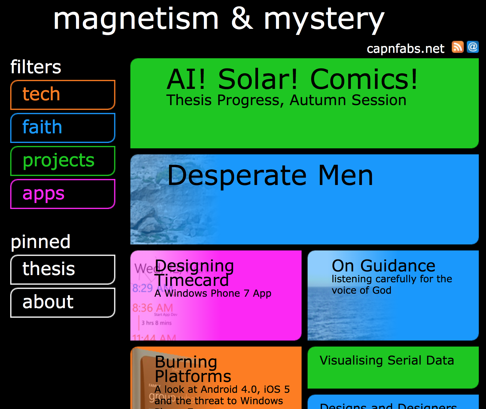
Version 1. Wow. At least it’s different, I guess?
Gosh Darn. What was I thinking? I think the laptop I was using then had terrible colour saturation. Also, I had to install Apache/PHP/MySQL and turn off a bunch of Deprecated MySQL-non-prepared-statement-API warnings to generate that screenshot. It brought back some bad memories (this is a good setup guide though).
Version 2
Version 2 was the same content, but converted to use Octopress 2, because the other site was kinda unusable, ugly and extremely difficult to maintain. It was also slow because it was stored in a MySQL database on a single server located in Melbourne, Australia (I think). It might’ve had a condition where the page rendering performance degraded the more articles you tried to load, too.
Anyway, now that I was using an entirely static site, I could move the whole thing over to Github pages, because I liked the idea of being hosted on a performant, worldwide CDN. This was mostly because of a desire to not be fireballed, because I had big hopes that something I wrote would one day be read by lots of people (lol). There was still a big focus on blogging and on content.
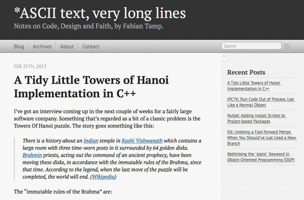
Version 2. Not as much personality; this was pretty close to the stock Octopress template.
Version 3
The Octopress blog was ok, but I found over the next few years whilst working full-time in a fairly demanding job that I didn’t really have time or energy to write. I found that I was returning to the idea of a domain as “an identity on the internet”, and was more interested in having a place to centralise content I’d produced elsewhere - on social media, particularly. So I started experimenting again late in 2014, and then rebuilt the site to the format you see today over the six months or so following.
Conceptually, what differs in this iteration compared to the last two is that it’s designed to stay relevant for minimal effort. I’ve done this by:
- Using a static site for the homepage, and then only putting dynamically-updated content down the bottom.
- Focussing on including content that I’m producing (or better yet, others are producing) from other parts of the web. I’m a heavy Instagram user, so Insta posts 📷 are included (yay!). I wrote the script / slides / choreography for a YouTube video for work, so that got included too.
- Using a permalink mechanism that I appropriated from Daring Fireball. Those little unicode flags (⚑) next to article titles on the archive format page and the home page link to the commentary on this site; the article title links to the content origin. I went with the flags because they were part of an older unicode spec and so they’re more broadly implemented, I would’ve loved to use a Cactus 🌵 or a Taco but browser support isn’t quite as strong for these codepoints.1
Design-wise, I’ve updated for a bunch of newer web paradigms. So, it’s responsive (go ahead, take a look on your phone!), space / cache-efficient, and super clean. Drop shadows are subtle. There are no peeling stickers. Remember when that was a thing? That was the worst.
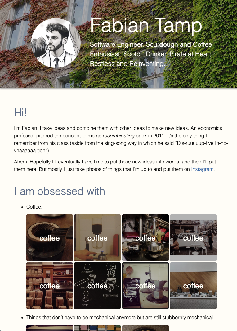
Version 3. Originally the background picture was the snow in Shemshak, Iran, here it’s a picture of the ivy in late summer in Berlin, 2016.
And that’s a brief history of the philosophy and design behind a very insignificant website. Take a peek at the code for v2 and v3 if you’re curious, or drop me a line if you’ve got any questions 😁
Update (Jul 2016): As time went on, I found that the commentary I was writing was pretty important for interpretation of the work. This was particularly true for Embassy Reviews and Emoji Haikus, both of which are a little more abstract than content I’ve historically produced. To reflect the fact that I thought this commentary was important, and easy to miss with this design, I inverted the paradigm so that a ➤ (
BLACK RIGHTWARDS ARROWHEAD) provides a direct link to the content, and the title is a link to the commentary. ↩︎