This website now uses margin notes instead of footnotes if your browser window is wide enough1. 🎉 If you’re reading this on a computer, you’ll probably be able to see them in this article if you maximise your browser window, and if you still can’t see them, you can try zooming out! If you’re on a mobile or an HTML5-compliant smart fridge (whyyyyy), there’s probably no hope for you, so here’s a video of the effect in action:
There will be an awful lot of footnotes in this article because of (a) unbridled enthusiasm for a cool feature I just shipped (b) I need a test suite for pathological cases. Sorry2 in advance.
Why Margin Notes?
A couple of weeks ago, I read an essay expounding the virtues of footnotes, in which Veit Heller writes:
I personally enjoy sidenotes – some call them marginalia – very much. They’re unobtrusive but close enough to the text to not break coherence…
[but] you might have noticed that I don’t use sidenotes on this blog. There’s a good reason for that: making sidenotes responsive is not easy.
Well, yes, I agree, but… well, maybe it’s not that hard? And maybe it would look cool? This idea kinda stuck with me, and then on Saturday morning, I decided to give it a shot.
I’m still not sure why I made that decision! It took about an hour to get the initial idea sorta working, and then another five (😅) to get it polished and working consistently. Here’s how I made it work.
Absolute Positioning?
At first, I thought I’d try absolute positioning. The premise is simple:
With Javascript, move the footnotes from the bottom of the page, and put them next to their in-text links in the DOM.
Give them CSS vaguely similar-ish to:
.footnote-container {
    /*
    Set this on the container so footnotes position relative to the
    container
    */
    position: relative;
}

.footnote-container .footnote {
    /* Position relative to the coordinates of the parent */
    position: absolute;
    /* 100% to move to the right of the container, + 2em for
    margins */
    left: calc (100% + 2em);
    /* Specify a width explicitly so that it wraps at some point
    rather than just being infinitely wide. */
    width: 25em;
}
This approach is enough to get something working! But it’s got a number of problems:
- Using
position: absolutemeans that margin notes would overlap in sections with lots3 of4 footnotes5. - “Put sidenotes next to the actual content” has a bunch of hidden complexity associated with it. Notably, I’d need to put them all back again if the reader shrunk the browser window.
- You have to deal with CSS inheritance. Unless I were careful, margin notes would end up inheriting the styles of the text they’re referenced in.
- I also wondered if it was kind of gross for screen-readers? But then I actually tried a screen-reader and realised that the footnote links also break text flow, so I guess it’s maybe not that much worse 😬?
The overlap issue is demonstrated by this example from The Bagel Code, which has a lot of footnotes in one paragraph to give references for a few interlocking ideas:
Oh. :(
Despite the issues, I was pretty bought in to the idea by this point. So I started looking for other possible solutions.
Drawing inspiration
I remembered that sometime in 2011 I read Bret Victor’s Magic Ink, and in addition to being super impressed with the content, I had apparently noted that it uses margin notes6. Maybe I could just lift Bret’s HTML+CSS implementation7?
Turns out Bret’s using this same positioning technique! And then has just been super careful about not adding too many in quick succession. I didn’t want that limitation, and also, I wanted to be able to share this with people as part of my Hugo theme, and I don’t like having gotchas in the code that I ship.
It sounds like margin notes are going to have to be aware of two things:
- the position of their anchors in-text, to ensure that they appear nearby, and
- the position of the margin note immediately above them, to ensure they don’t overlap.
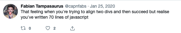
This is the point at which I was pretty sure I wouldn’t be able to do the layout with CSS. It was time to break out the Big Guns:
Doing it with Javascript
In the end, I did the positioning with Javascript. The idea is pretty straightforward, but ironing out the edge-cases gets technical quickly:
- Assume non-floating footnotes by default. This is what we already have, and it will continue to be the small-screen experience.
- Make a CSS class,
.floating-footnotes, which repositions the entire.footnotessection to the right of the article content, using the same absolute positioning technique as before. - When the script first runs, or the article content reflows:
- Check if the width of the page is ‘wide enough’
- Add the
.floating-footnotesclass to the.footnotessection, to trigger the repositioning to the right of the article content - Compute a target vertical position for each footnote such that it’s aligned with its in-text reference, and so that it doesn’t overlap any previous footnote
- Set
position: absoluteandtop: XXXpxon the individual footnotes to meet these vertical position goals.
Of these steps, the two that were surprisingly complex were aligning the individual footnotes, and watching for article reflows. Let’s talk about those now.
Aligning individual footnotes
This felt complex because I needed to ensure that I fully understood CSS positioning to make it work.
Here’s the code to compute the offset for a given footnote:
// Computes an offset such that setting `top` on `footnote` will put it
// in vertical alignment with targetAlignment.
function computeOffsetForAlignment(footnote, targetAlignment) {
    const offsetParentTop =
        footnote.offsetParent.getBoundingClientRect().top;
    // Distance between the top of the offset parent and the top of the
    // target alignment
    return
        targetAlignment.getBoundingClientRect().top - offsetParentTop;
}
There’s a lot packed into the two lines in that method:
- First, we get the
offsetParentforfootnote. TheoffsetParentis the closest parent element with a CSSpositionset, and therefore the basis for positioning iffootnoteis positioned asabsolute. - We get the bounding rectangle for the
offsetParent, which is in page coordinates, and then get the top of that rectangle. If theoffsetParentis 300px down the page, this will return 300px. - We also compute how far down the page
targetAlignmentis (getBoundingClientRect().top). - Finally, we subtract the two values to determine a value for
footnote.style.topwhich will give the required alignment.
It’s probably easier to represent this visually, so I drew this diagram:
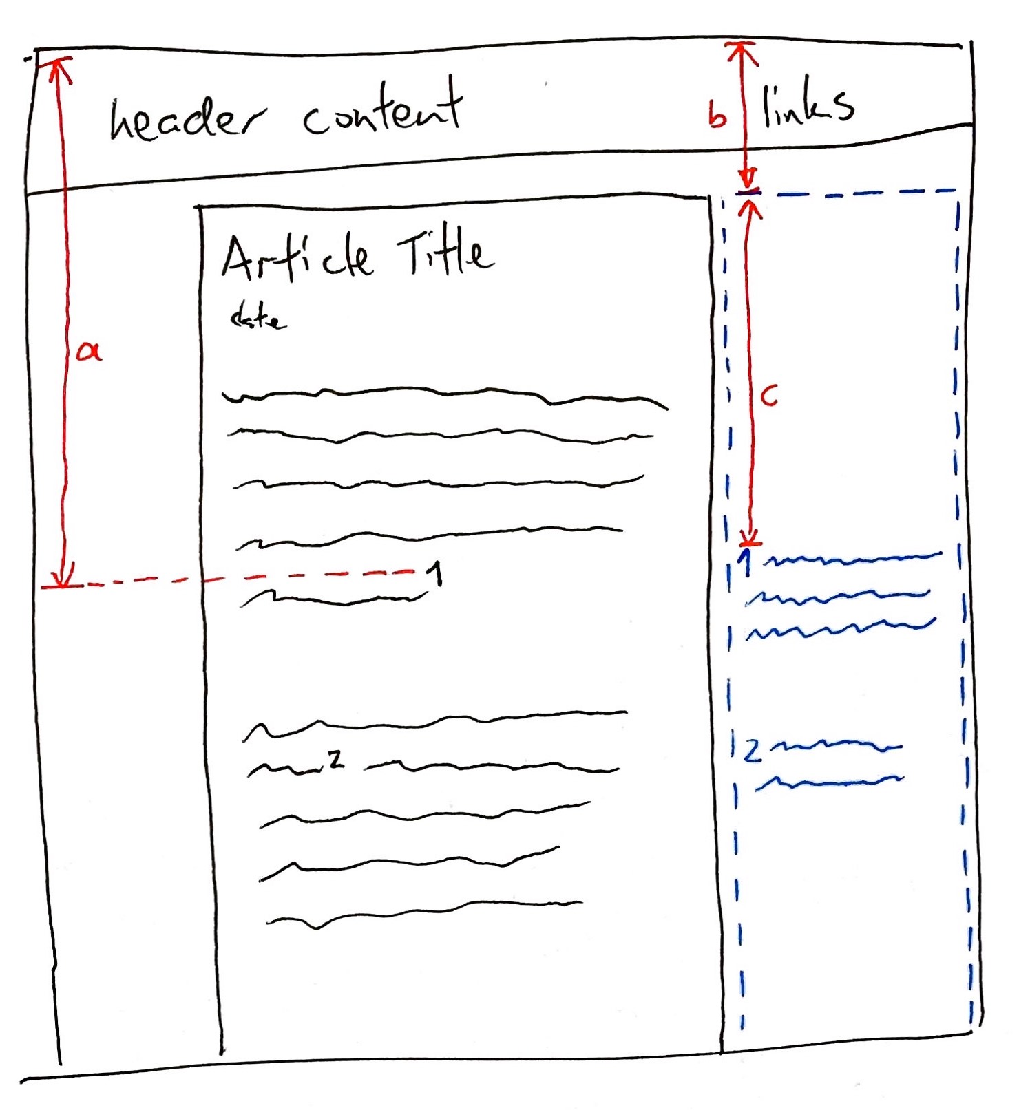
- (a) is
targetAlignment.getBoundingClientRect().top, i.e. the distance between the top of the footnote reference and the top of the page. - The blue dotted box is the
offsetParentfor the individual footnotes (this is the footnotes section / container; we gave itposition: absoluteearlier to move it to the right hand side of the article) - (b) is
footnote.offsetParent.getBoundingClientRect().top, i.e. the distance between the top of footnotes container and the top of the page - (c) is what we’re trying to compute – the distance between the top of the footnote container and where the footnote should be positioned.
Once you’ve made this computation, you need to add collision-avoidance code. Mine works by keeping track of the offset of the bottom of the last element (bottomOfLastElem):
if (offset < bottomOfLastElem) {
    offset = bottomOfLastElem;
}
// Set this so that the next element doesn't clobber this one
bottomOfLastElem =
    // calculated offset for this footnote
    offset +
    // height of this footnote, including padding
    footnote.offsetHeight +
    // margins for this footnote. Have to parse them to int because
    // they're always represented in pixels with the `px` suffix.
    parseInt(window.getComputedStyle(footnote).marginBottom) +
    parseInt(window.getComputedStyle(footnote).marginTop);
In the end, I decided to align the margin notes to the top of the containing paragraph, not to the top of the actual footnote. I think that this looks a lot cleaner. Most of the time, my paragraphs should be short enough that it’s not disconcerting to have a margin note slightly above its in-text reference.
Watching for article reflows
I found that the above alignment strategy mostly worked well, except for articles that had embedded tweets.
I had a theory that the embedded tweets were causing content to move around in the article, which meant that I’d need to recompute the position of the footnotes after they’d finished loading. It’s possible to watch for changes in the DOM, but I don’t think that can detect when an iframe has resized because it’s finished loading, which is what was causing this specific problem.
Footnotes are converted to margin notes once the page finishes loading, and then the browser asynchronously loads the iframe containing the tweet, which throws everything out of alignment.
In the end, I stumbled across ResizeObserver, which allows you to monitor changes in the size of an element8. It seemed promising, but it’s not (as of Jan 2020) widely available. There’s a few polyfills available for it though! I grabbed this one and tried to pull it in to my Javascript file… but the readme mentions modules everywhere.
Hmmm, modules. Aren’t they a Node JS thing?
I’d been so keen to avoid the whole Javascript Package Manager / toolchain / install a million packages from NPM thing. But, ok, maybe it’s not so bad; let’s look for something lightweight that does the trick.
A Javascript toolchain for people who don’t like Javascript toolchains
The first question I ran into was: what exactly do I need to install?
I knew I’d need a package manager to install the @juggle/resize-observer package. I guess normally you’d just use NPM for that? At some point in my exploration I read this comparison and decided to take a look at Yarn, an alternative frontend to the NPM repository. The Getting Started guide was extremely straightforward, and so I guess I ended up using Yarn because it Just Worked9.
The second question: I’ve now got multiple JS files, and that module that I installed from NPM with Yarn. How do I bundle all these together?
You can see my thought process through my Firefox history:
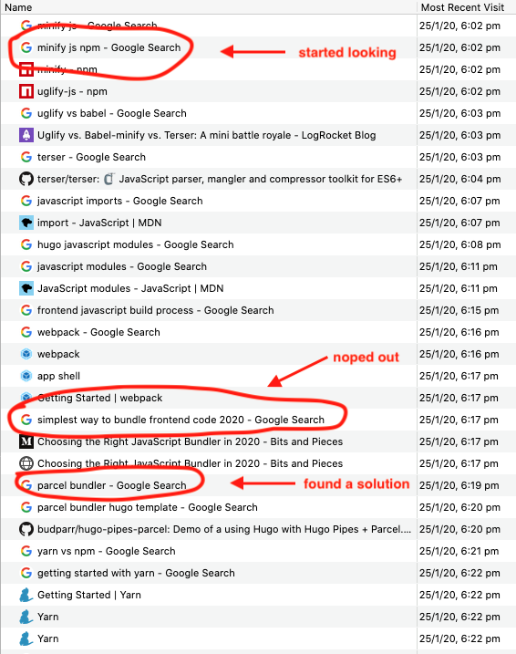
At some point I just noped out and googled “simplest way to bundle frontend code in 2020”10, and Google delivered! I chose Parcel, which explicitly promises zero configuration.
I’m usually a bit wary of ‘zero-config’ claims, and in this case, it turns out you set all the options via the command-line 🙃 but, if you don’t, it still works11, and the command’s not that complex, so it’s ok.
So now, to package up all the JS for the application, I run
parcel build \
  --no-source-maps --experimental-scope-hoisting --out-dir static/js \
  js/main.js

# This works fine too; it makes the build ~2kB bigger
parcel build --out-dir static/js js/main.js
Available now in the paperesque Hugo theme
I’ve bundled all this up into the paperesque Hugo theme, which is what I’m using on this site. I’m super happy with how this feature turned out 🥳. You can get the source on Github or check it out on Hugo Themes.
Specifically, ‘wider than 1260 pixels’. ↩︎
Not sorry. ↩︎
Here’s an example of lots of footnotes in quick succession. ↩︎
Is this overusing footnotes? Probably! It’s great for looking smart, and not so great for communicating ideas. But sometimes it’s hard to stop yourself, or you need to cite a lot of references in quick succession. ↩︎
You’ll notice that I figured out how to get around this ‘overlap’ issue. We’ll talk about how shortly. ↩︎
And it turns out he in turn borrowed the margin notes (and lots of other ideas) from Edward Tufte’s books, which Veit also references in his essay. ↩︎
Also it’s pretty wild to me that the same HTML/CSS works as well in 2020 as it did in 2006, when Magic Ink was written. The world-wide web is one of the best examples of long-term compatibility we have in software development (along with Microsoft Windows, which can still run binaries from 1995). ↩︎
Currently, the code watches the size of the article content div to see whether a reflow is required. This isn’t perfect – in theory, the relevant container could stay the same height while two inner elements changed at the same time, which would potentially not trigger the resize. I imagine that situation is extremely rare for Hugo sites, though, so I think we’re probably safe. ↩︎
“It Just Worked” is a huge testament to the Yarn developers and documentation team. I’ve got a newfound appreciation for how difficult this is after shipping Grouse and getting bug reports from users whose sites are only almost supported. ↩︎
Admittedly, a risky move considering it’s still January. ↩︎
I like this philosophy! ‘Just Works’ out of the box, has options if you need them. Again, this is really simple to say, and really hard to get right. ↩︎