I wrapped up at Google last week, but I spent the months before I left working on an Australian Election tracker map, which was completely unlike any project I’d worked on before.
We first assembled the team for this about 10 weeks before the election, from a number of teams across Google Sydney. By the time we actually started building anything, it was about six weeks out from the election.
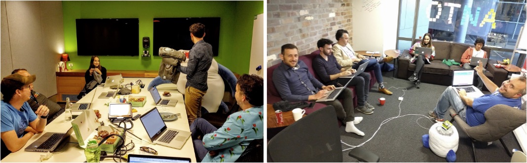
Team photos. On the left, you can see me stuffing T-shirts into Barry, the friendly office bean-bag shark.
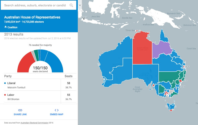
The website had two main goals - to provide information on where to vote, and to provide live results after the official data feed went live on the day.
Tech stack
We used Google App Engine to serve everything. App Engine was super easy to use - being able to write code and have it scale automatically is a huge win to me.
The backend was written in Go. In addition to the HTML / JS / CSS for the web app, it served static geographical data, which is publicly available from the Australian Electoral Commission (AEC).
For data sources that needed to update live, we used Firebase. This included live election results, and information on which polling booths had sausage sizzles and cake stands (it’s an Australian tradition).
We wrote the frontend in Dart, using Angular 2 as the framework to tie everything together.
I spent most of my time working on the geographical data backend and building out the web UI, so in this article I’m going to focus on those aspects.
Serving geospatial data
The representation of election results on a map was seen to be one of the most interesting differentiators between Google’s election map and other coverage. This turned out to be significantly challenging to implement though.
Basically, we wanted to be able to:
Serve the shape for each electorate as GeoJSON, or ideally as Google Maps Encoded Polyline, so we could render it using the Google Maps API.
Do spatial lookups:
- Which electorate are in a given bounding box?
- Which polling places are in a given bounding box?
We were able to make the assumption that geographical data was static - once the electorates and polling places had been defined, they weren’t going to change frequently. This meant that we could build them directly into whatever serving infrastructure we used, which makes scaling easier.
We started by investigating Carto (formerly, CartoDB), and found that it was a lot of extra infrastructure for the small amount that we wanted to use. We basically would’ve ended up falling back to their SQL API for queries, and so we might as well just use PostGIS in a PostgreSQL database and use that instead 1.
PostGIS, however, is a little tricky to get set up. We got it running with the sample AEC data inside a Docker container, with the intention to serve static geographical data from a cluster running on Google Container Engine.
This meant that we’d also have configure App Engine to talk to our PostGIS instances, and scale them separately, which adds another dimension of complexity. One of our engineers started wondering if there was another way, and knocked up a prototype solution directly in the Go app using go-shp (to read the shapefiles from the AEC) and rtreego (for lookups). This turned out to be a significantly less complex solution. Our code loads the shapefiles once on startup, and then serves them from memory for the lifetime of the service.
The AEC shape data worked out to be around 46MB for all of Australia, so we manually ran some preprocessing using Mapshaper to simplify the polygons down to more efficient sizes for different zoom levels. Using this scheme, we managed to keep the page load down to < 500kB.
This turned out to be super performant - one engineer estimated that each instance was capable of roughly 4x the same load as the python servers he’d written for a previous, similar project. We managed to squeeze even better performance through some clever caching design from some of the engineers on our team.
Frontend: Angular2 and Dart
I should preface this section by saying that I don’t have a lot of experience with web frontend development. If I’ve said something that doesn’t sound right to you, please let me know – I’m keen to learn :)
Angular 2
I really enjoyed working with Angular 2 - it seems like the authors have further refined the concepts from Angular 1, and streamlined the whole framework. Once you learn the ropes (which was only a few days of struggling for me) it’s a really fast way to get something up and running. I don’t have a lot of experience with Javascript and web UIs in general, but Angular 2 made development fun.
Hemicycles and half-donuts
Angular isn’t without its frustrations though: there are some things that Angular’s abstractions just don’t work for. I implemented this rather fabulous component:

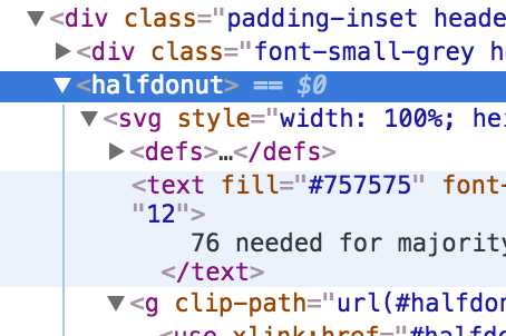
Fun fact - this seating arrangement is officially called a Hemicycle. I didn’t know this until the BBC used it on their Brexit real-time results feed (though this seems like a weird choice for a Yes/No vote with no quota). Our version of the hemicycle is thus known throughout the code as the half-donut component:
YOLO.
Anyway, using Angular for this got a little gnarly. There’s a lot to this component:
- Combine certain parties into representative coalitions
- Sort all parties from most to least votes
- Allocate them to the left or right of the hemicycle based on whether they’re a “left-leaning” or “right-leaning” party2.
- Draw a donut slice (yes, that’s what its called in code) for each party. Each slice has to have the correct starting angle and ending angle.
Rendering is the part where the abstraction felt a little leaky, and Angular felt like more of a toolkit to get the job done rather than a comprehensive solution to “do things right”. As I write this section, I’m starting to wonder if Angular’s actually about as good as it can get here, and the web is just a bit of a mess.
My first rendering algorithm was:
- The
HalfDonutComponentgenerates a set ofDonutSlices, each having a starting angle, an ending angle, and a fill colour - The template for the
HalfDonutComponentfeeds theDonutSlicesinto aDonutSlicePipe, which generates the appropriate SVG path. Unfortunately, there’s no way to render arcs using angles in SVG - they use X,Y coordinates instead (whyyyyyyyyyy?). This meant that I had to do more trigonometry than I would’ve liked.
This definitely worked, but in the interest of keeping the code simple and maintainable (and at the suggestion of a colleague), I changed it to the version embedded above (if you’re inclined, open the inspector and have a look at the generated SVG).
The new rendering algorithm:
- The
HalfDonutComponentgenerates a set ofDonutSlices, each having an ending angle only. - There is a single half-donut path, which is reused multiple times.
- The component creates multiple copies of this half-donut path, colours them differently for each party, and uses
transform="rotate(angle, X-center, Y-center)"to angle them into the right positions (no complicated trigonometry!). - Right-aligned parties get rotated with a negative angle instead of a positive angle.
- Clip the SVG, so that the area under the half-donut isn’t visible.
This produces a pretty nice result for a lot less code:

Dart
Dart felt like it was getting in the way as much as it was helping. Dart’s object streaming framework works really well with live updates from Firebase - it’s possible to just rebind parts of the UI as things change. Dart’s error messages, however, were often hard to understand. Debugging was complicated, because Dart is only natively supported in Dartium, a custom build of Chromium. Builds took a surprisingly long time, and optional typing is very error-prone – we had a hard-to-diagnose JS error related to this that took weeks to find, mostly because we hadn’t enabled the relevant static analysis on build. In my opinion, this shouldn’t be necessary - language behaviour that changes between development and production builds is a bad idea. I think I’d like to try Typescript next time.
See also
I should note that if you were ok with using Carto for web map rendering as well, then it works really well as an integrated suite. That’s the approach that Democracy Sausage were using. ↩︎
Australian politics is mostly a two-party affair (but decreasingly so!). The Australian Labor Party is usually represented on the left of the hemicycle and the coalition of Liberal, National, Liberal-National, and Country Liberal parties (‘The Coalition’) is usually represented on the right. We needed to do something with other minor parties that get votes, so we put smaller slices in the middle, but if a party gets less than three votes, it’s aggregated into a ‘Other’ component. ↩︎